First let’s chat about why there is a color of the year.
In 1999 the Pantone Color Institute created the COTY educational program to engage the design community and color enthusiasts around the world to generate conversations around the relationship between culture and color. Color of the year is selected through a committee of analysts who look at trends across a variety of industries. The announcement is for many the kick-off points in design, companies partner with Pantone prior to the release in order to have special versions of the products, featuring the chosen color. Pantone’s marketing blitz has been so successful that many companies followed suit. Obviously, it is all about driving sales.
 A 2015 study from the Color Marketing Group found that 85% of consumers base their purchasing decisions on a product color..think how iPhone creates a coveting of the latest phone color. Color of the year themes spark obsolescence – everything has a 3-4yr lifespan, passe even though it’s perfectly fine. Example, in 2020 three of the leading brands chose deep shades of blue, Pantone called in classic Navy, PPG/Dulux chose Chinese Porcelain and SW selected Naval, all rich hues creating a calm grounding drawn from midnight skies and depths of ocean.
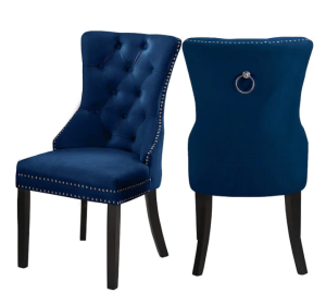
Prompting stagers to integrate into their projects with dining chairs like these, currently on sale for $399 ($799) from Nova.
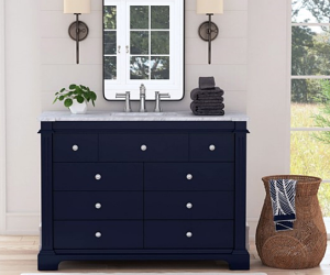 Bellacor Pro has this vanity on sale currently for $1,590 ($2,272) and see the navy throw, beautifully integrated on this staging project by Mandy Patterson, InHanceIt Staging in St Louis.
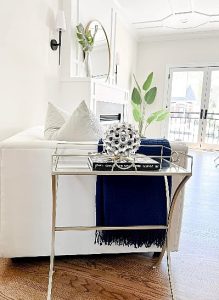 So if you have anything Navy in your inventory it’s time to think about sliding it out over the next six months as we move over to lighter blues. Which brings us to 2024 SW color of the year UPWARD.
Around the world people are fed up with stress, fatalism & the pressures of work.
SW spokesperson Sue Waddens confirms “there is definitely more focus on wellness and being your best self”.
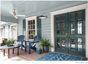 People are seeking a feeling of freedom, peace and serenity in their life and home, which is why the Coastal Grandmother aesthetic, which started a few years ago is still sweeping away all traces of gray bringing with it the fresh, breezy, coastal infusion of peacefulness for any space. Seen here is Behr’s 2020 Watery (HDC-CT26) on the ceiling and siding. I think it would have looked better with the navy doors and shutters vs what they used and the rug sure doesn’t work – but I digress — Sue Wadden, director of color marketing at Sherwin-Williams, in a press release said,
“Upward SW 6239 represents the gentle forward momentum in all of our lives,” says . “It brings to life that carefree, sunny day energy that elicits a notion of contentment and peace. With this color, we invite our consumers to take a pause and infuse a new sense of ease and possibility into their spaces—one that doesn’t overwhelm, but rather establishes meditation and tranquility.”
Upload your own room here and try it for yourself.
Simple Add-on Service For Your Staging Business
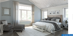 Now what about a simple, add on service for your staging business? Refreshing the home, they live in. The main bedroom is often the last in the house to get any attention so who wouldn’t like a bedroom room refresh in five steps for under a $200 shopping fee? Let’s look at this bedroom from the SW site showing the new UPWARD color on one wall. Pretend it is your client who fell for the advertising, whipped out on Saturday morning, bought paint, and covered one wall, hoping the bedroom would feel brighter. Now what if they also have gray furniture & can’t make any big changes at this time. Which inexpensive fixes would lighten, brighten and make the blue wall work? It can be as simple as changing the shams, cushions, throws & art.
 The bench at the end of bed is taking up space, too high, wrong style and not useful so I would advise they sell it to help fund the new materials and push the gray ottoman close to the chair to look like a chaise. Remove the distracting art from above the headboard(even though they are simple they weigh the space down)
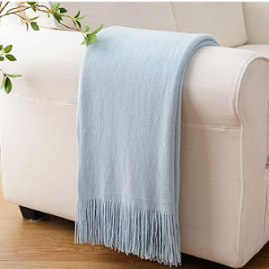
Starting with the chair in the corner:- switching the gray throw for this soft cozy, watery blue with tassels, layers texture for feelings and starts to balance the blue wall. Buy here on Amazon for just $31.99.
 For $16, I would select this cushion to quietly connect the gray furniture while incorporating the blue and instilling a subtle message of slower times, relaxation and putting time on hold. BUY here:
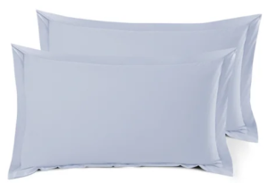 Change the shams, close to the headboard for barely there, ice blue like these from Wayfair BUY for $35.99
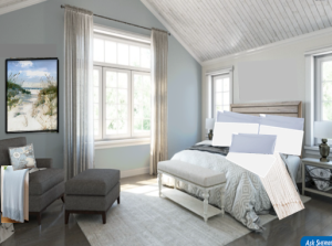 Cushions are not pillows; they convey a different meaning so pack all of them away, or sell on marketplace. They are heavy & dark, stealing the tranquility we are looking for. Add plain white pillows, not cushions, then add an additional layer with a wondrously textur-ous bed runner/scarf like this one from Battilo # $44 in the photo looks cream but it is white, the textured background almost a soft gray.
Remove the mirror, it is hung too high and not doing a thing for the space, wrong style, hard metal and not reflecting anything of value. Switch for an alluring view of “away from here” like this framed canvas (I might try without frame or white vs black) from Wayfair $75. Beachcrest Home Dune View Framed On Canvas Print & Reviews – Wayfair Canada Personally I would take the drapes down too, even though they are neutral they close up the window space making it feel different.
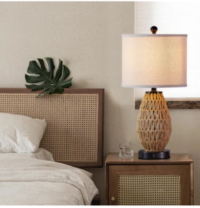 When money available I would add a rattan tray to the ottoman for books and change out the lamps maybe something like these from Wayfair.






 Subscribe Today!

